What Is a Dark Sky Map?
A dark sky map is an interactive or static visualisation of light pollution across a geographic area. It shows the artificial brightness of the night sky as measured by satellite instruments — primarily the VIIRS (Visible Infrared Imaging Radiometer Suite) onboard the NASA/NOAA Suomi NPP satellite. These maps assign colours to different levels of sky brightness, with black/dark blue representing pristine natural darkness (Bortle 1–2) and white/red representing severe light pollution (Bortle 7–9). The most popular dark sky maps for US observers include the Light Pollution Map (lightpollutionmap.info), the National Park Service's Night Skies interactive map, and NASA's Earth Observatory "Earth at Night" imagery.
Using a dark sky map is simple: find your location on the map, note the colour band, and look for darker-coloured areas within a reasonable driving distance. A one-hour drive from a major city can often improve your sky quality by 2–4 Bortle classes — the difference between seeing only the brightest stars and witnessing the full splendour of the Milky Way. The maps also show the locations of certified International Dark Sky Parks (IDSPs), which are your best guarantee of consistently dark skies.
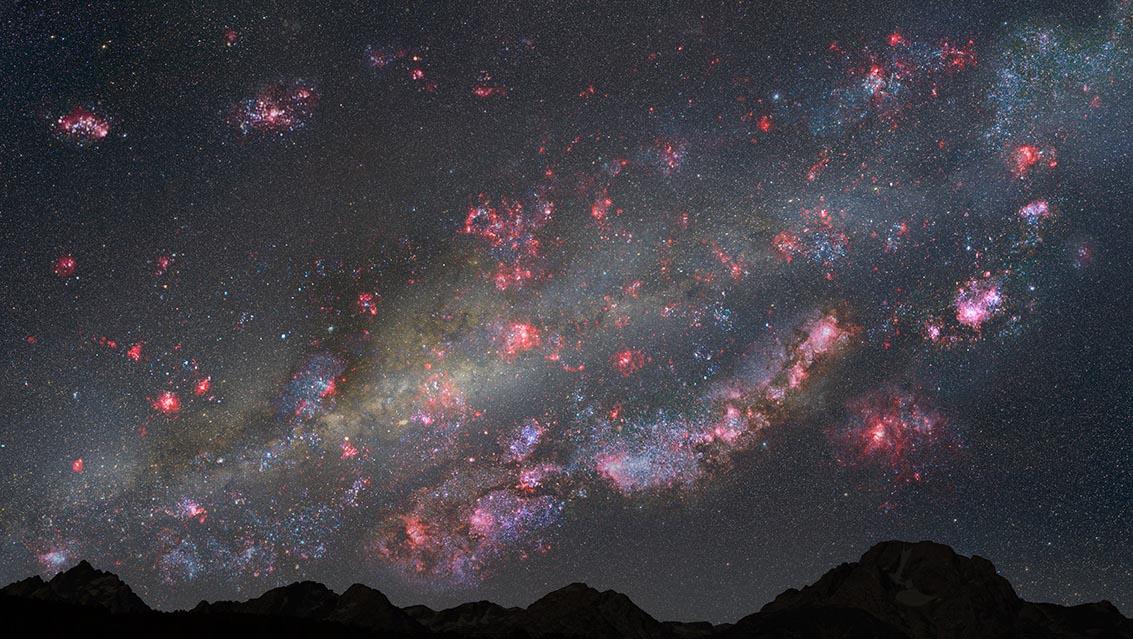
Credit: NASA/JPL-Caltech — The Milky Way over a pristine dark-sky site